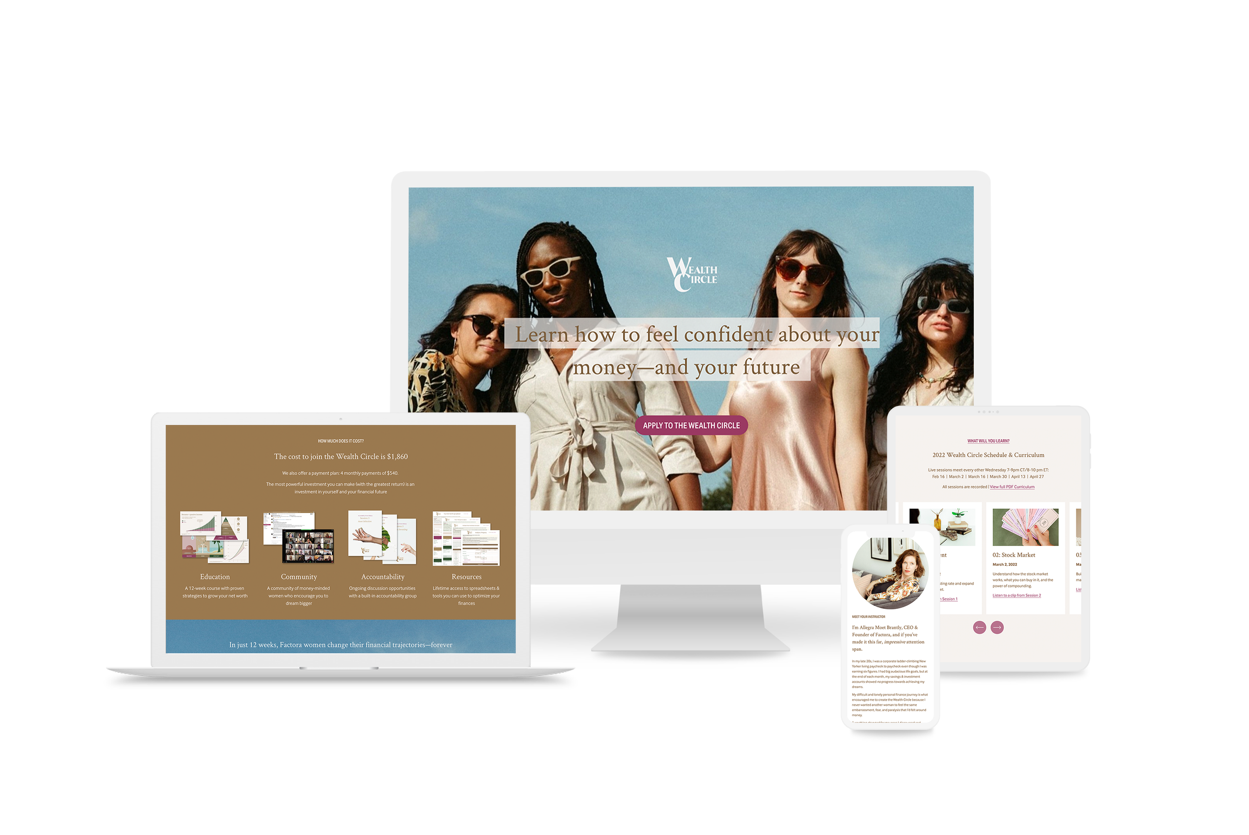
Factora: Wealth Circle Sales Page
Crescendo Design Studio partnered with Factora to spruce up their Wealth Circle product sales page.
Enrollment for the next 12-week course was coming up, and the marketing team at Factora wanted to get their page ready with fresh content and a streamlined visual approach.
Step 1: Select the Content to Keep
Crescendo worked with Factora’s marketing team to sift through previous content and decide how to use what we wanted to keep.
We went through photos, calls to action, statistics, charts, graphs, and testimonials. Through an iterative process, we began to shape the message and tone of the new sales page.



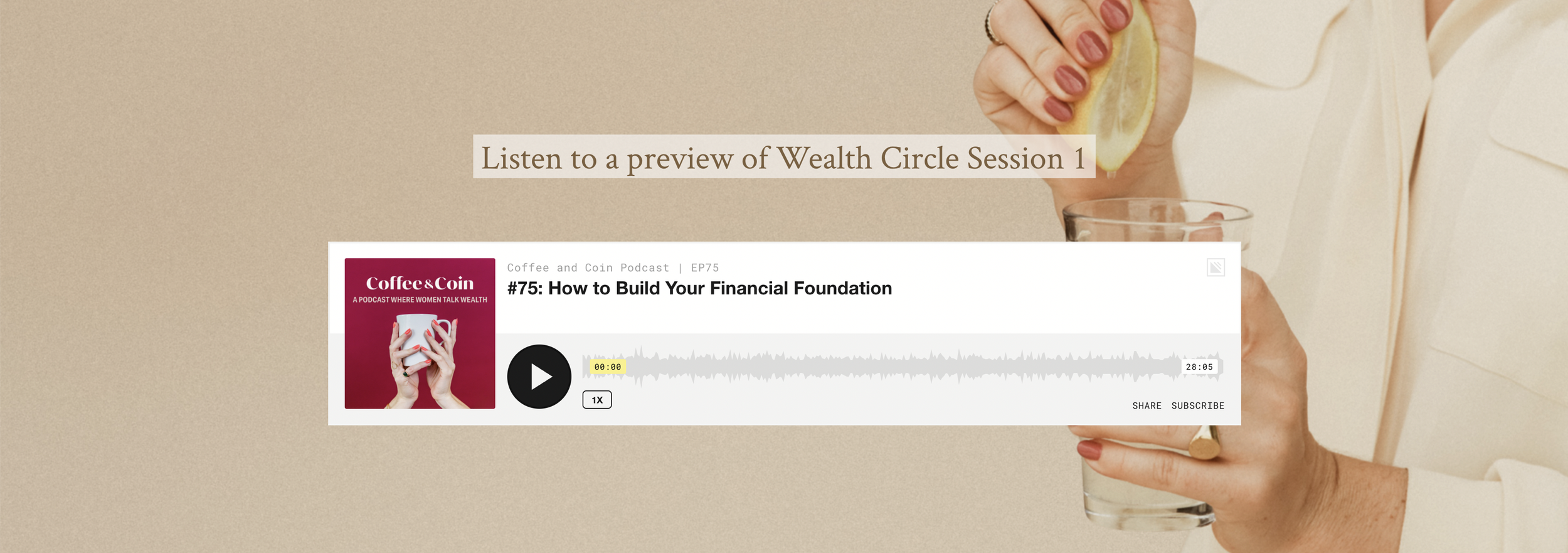
Step 2: Style the Content
Factora had a beautiful visual brand that already existed. Our focus was to create strong visual systems and continuity that tied from marketing through to product.
Through Crescendo’s work with the product team on the Wealth Circle Presentations, we began to create a consistent look and feel that felt in line with what customers would see once they signed up and took the Wealth Circle classes.

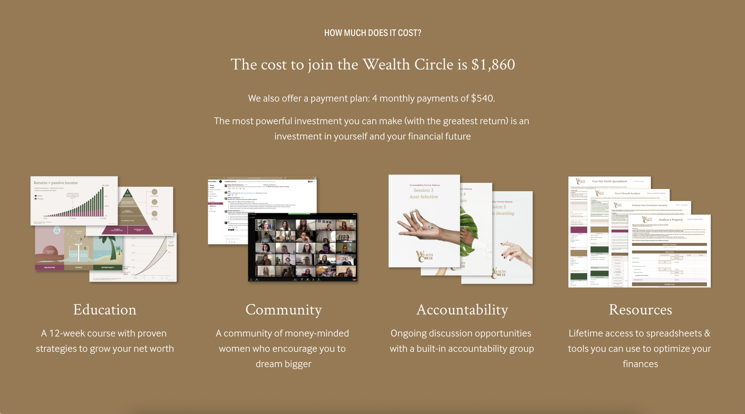
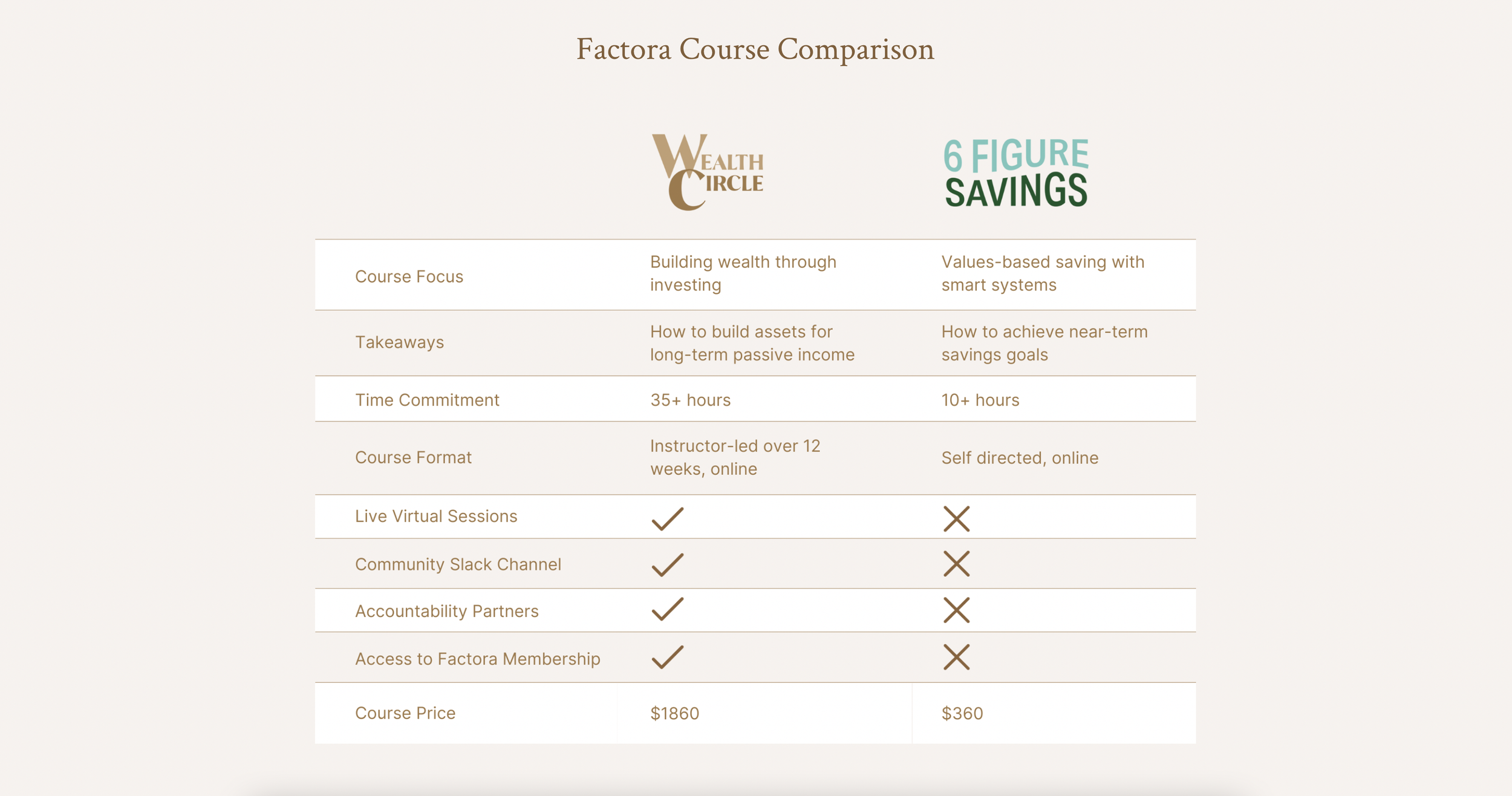
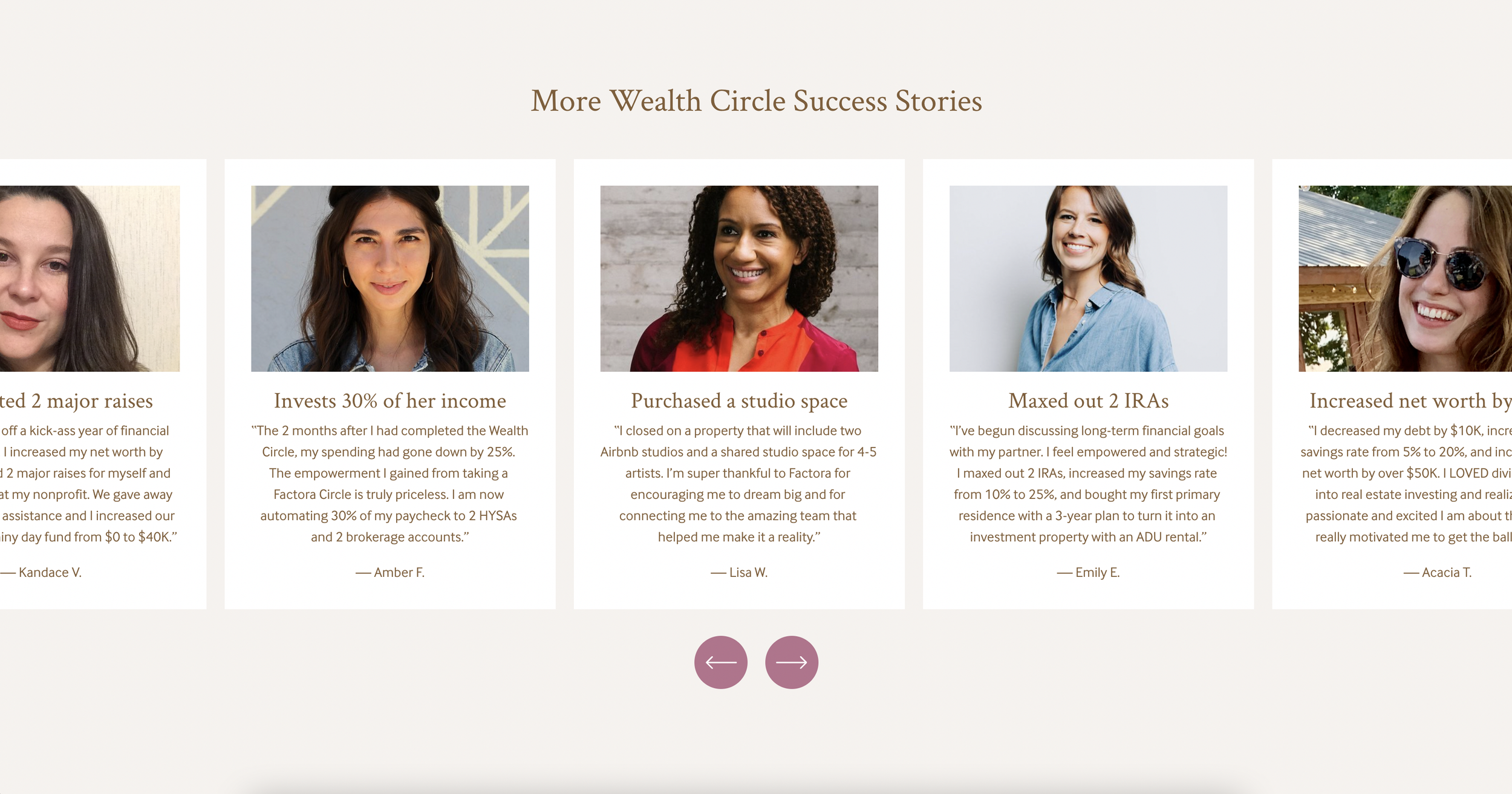
Take a look around:
The result was a sales page with dynamic content, compelling testimonials, and a new level visual consistency across the entire brand.

