Online Course Presentation Design: Factora Wealth Circle
Factora came to Crescendo with a beautiful existing visual brand. Their goal was to better incorporate that brand into their 12-week Online Wealth Circle Course, and to create consistency not only across the six bi-weekly presentations, but throughout their suite of product materials.
Part 1: Deck Template
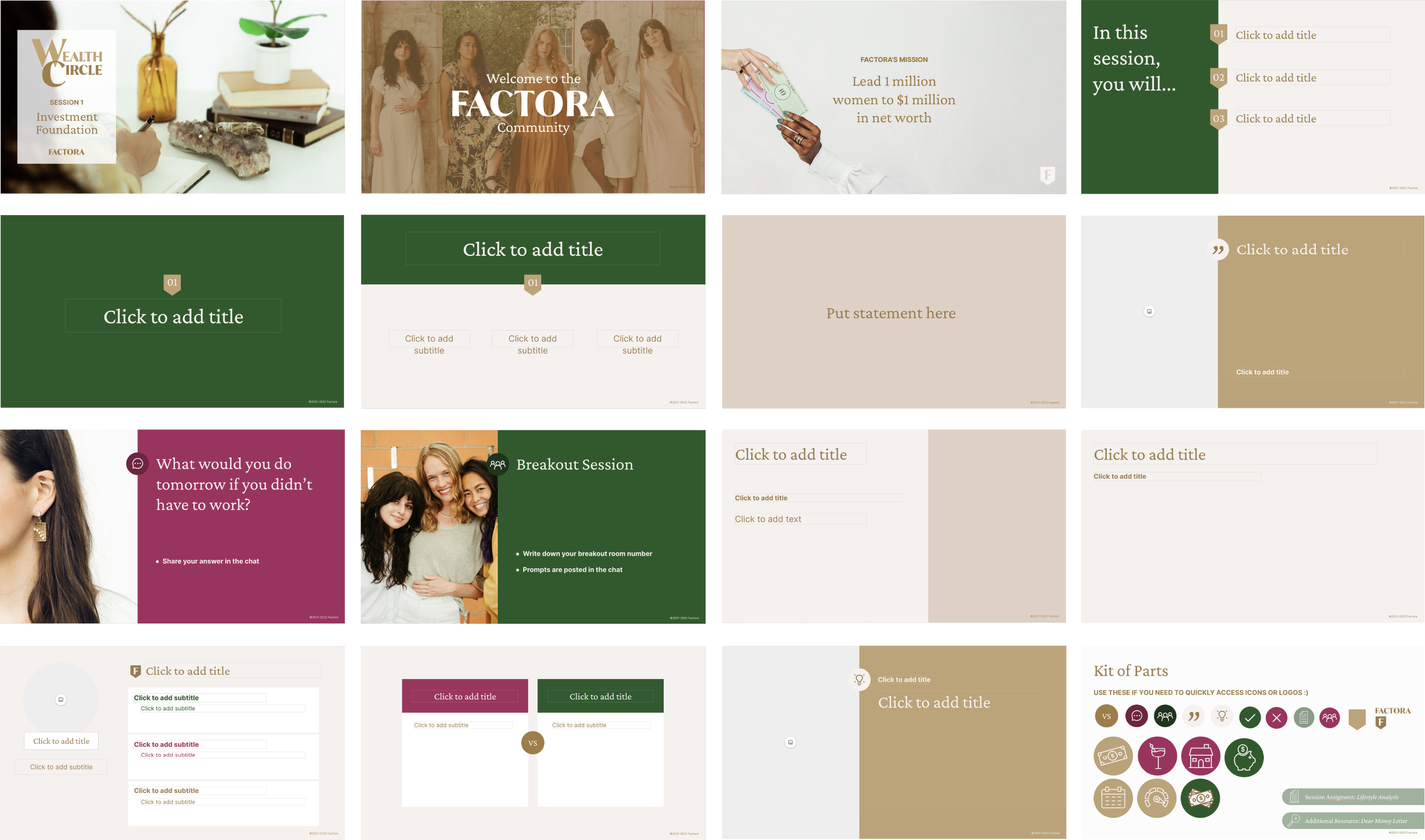
We started with a birds-eye look at their existing slides and content, and formulated a basic template that could flex across their entire suite.
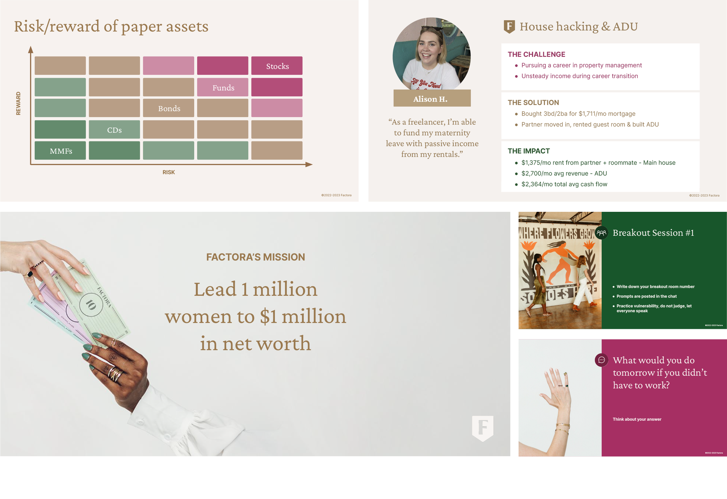
We created visual systems for session contents, breakout sessions, poll questions, case studies, charts and graphs, and assignments.
Part 2: Apply the Template and Customize
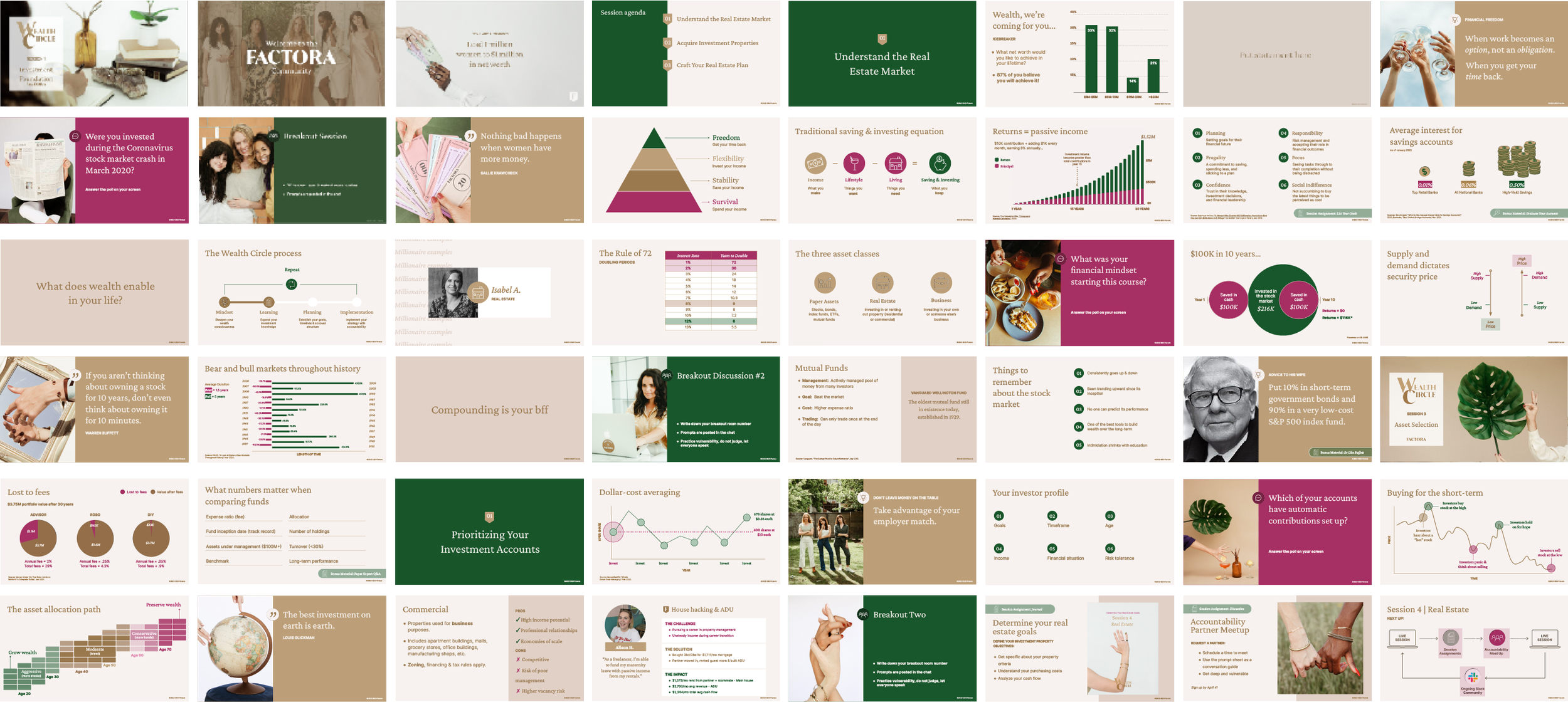
Once we had our basic visual system in place, we could start applying the template across the six session decks.
Custom design work and finessing within the template got us to a place of visual consistency, and our vision of a cohesive online education product started coming to life!
Part 3: Unify the Online Portal Visuals
As part of the course, Wealth Circle members have access to an online portal with their prep work, assignments, resources, and recordings of the classes.
We brought over icons and styles from the suite of decks to create custom graphics within the portal. Now, a Wealth Circle member’s experience would be consistent across all touch points.
From the client:
“Ok just had to reach out and say you are doing SUCH AN AWESOME JOB on Factora’s brand look and feel. I’m so glad we found a way to continue working with you for our product and marketing needs/next evolution. We’ve come such a long way and you are helping to *crispin* it all up!! Thank you, thank you, thank you!!”


