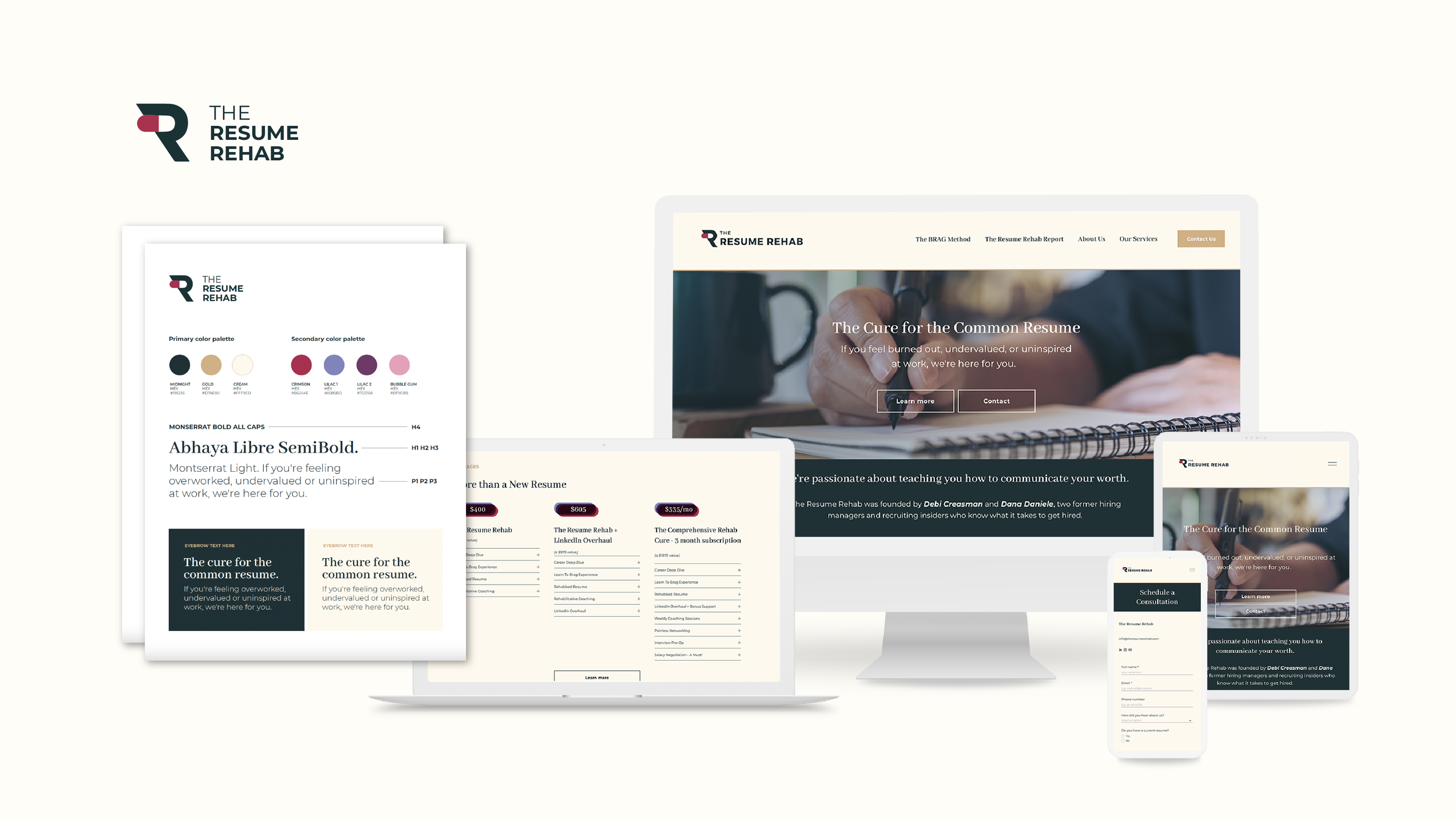
Resume Rehab Website Redesign
The owners of Resume Rehab reached out to Crescendo for help with refreshing their website based on one inspiration photo they both really loved for it’s colors – a pigeon!
We took inspiration from the pigeon’s colors as well as the overlapping shapes that make up the body of the bird. From there we crafted a primary and secondary color palette, as well as typefaces and type hierarchy to inform the style of the site.
Primary and secondary palette inspiration.
Overlapping shape inspiration.
Brand cheat sheet with colors and fonts.
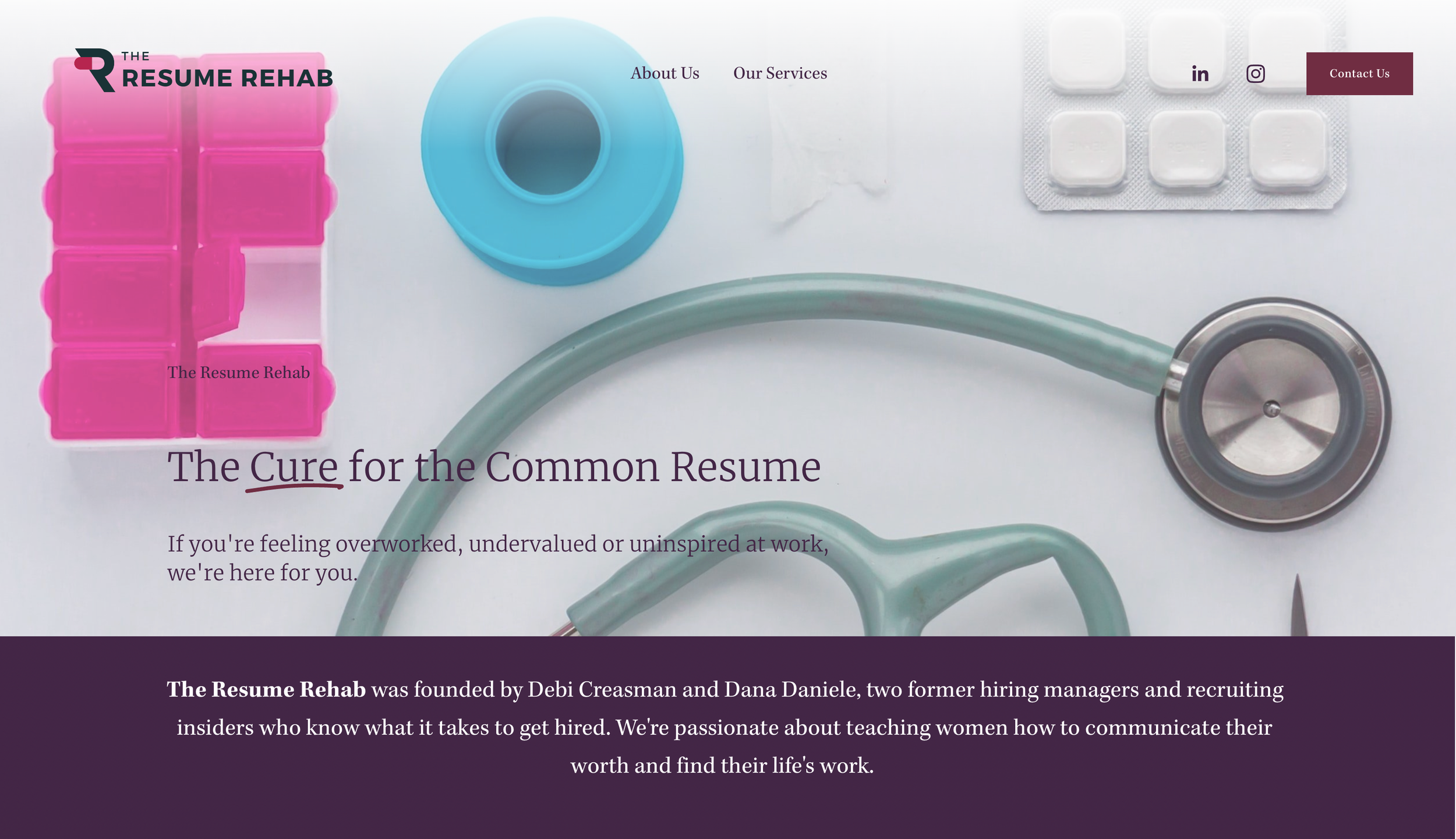
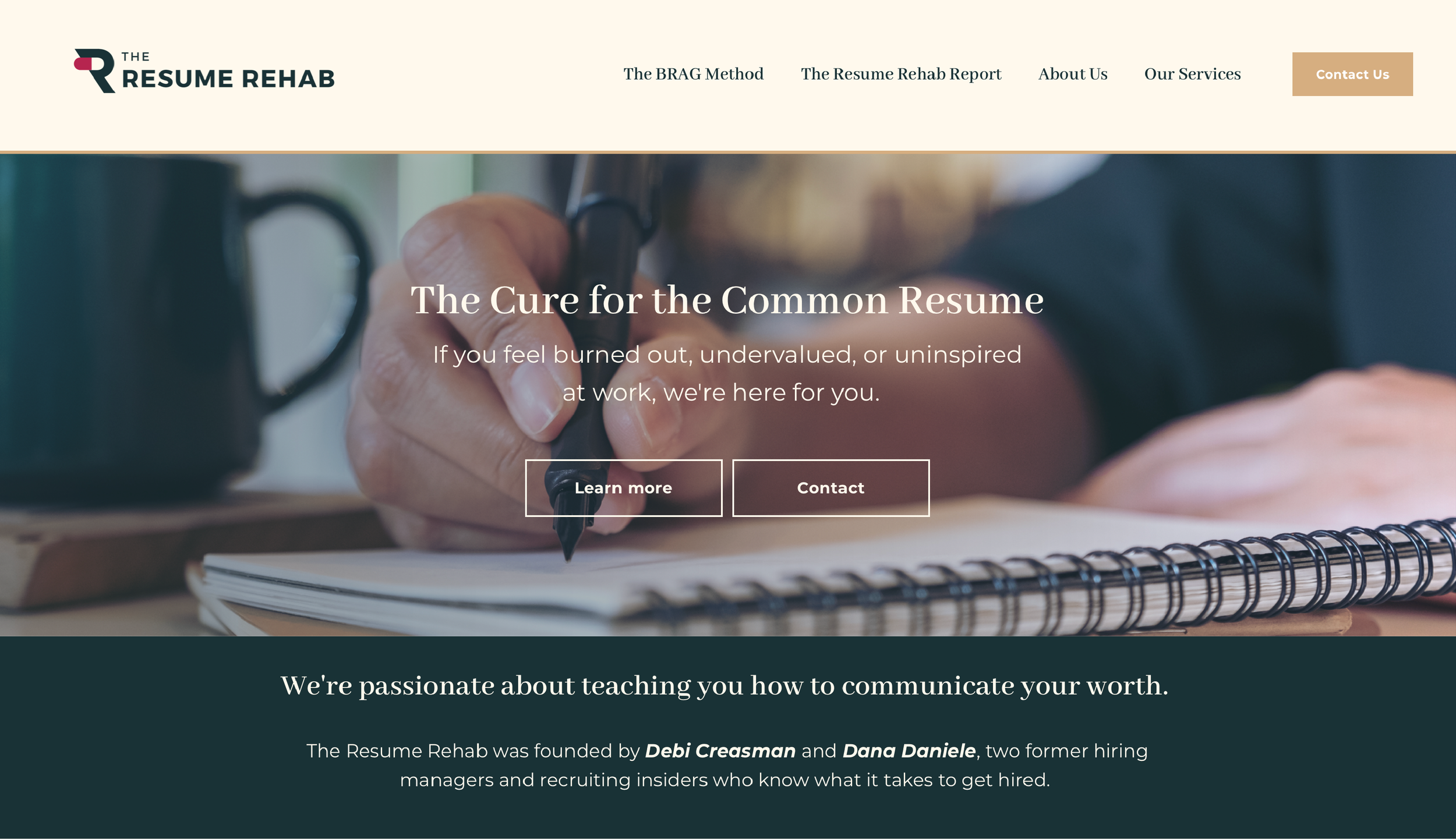
Before and Afters
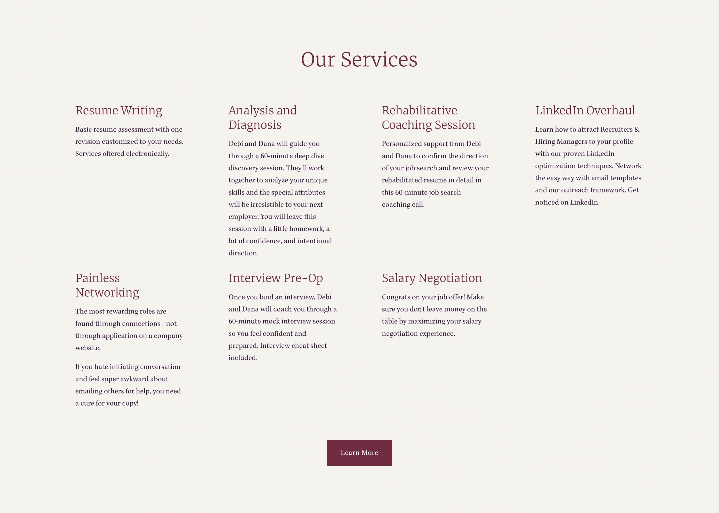
We kept the main content, but restyled it for a more polished and professional feel. We also chose photography that spoke more to the feel of the services Resume Rehab offers, instead of relying so heavily on medical rehab.
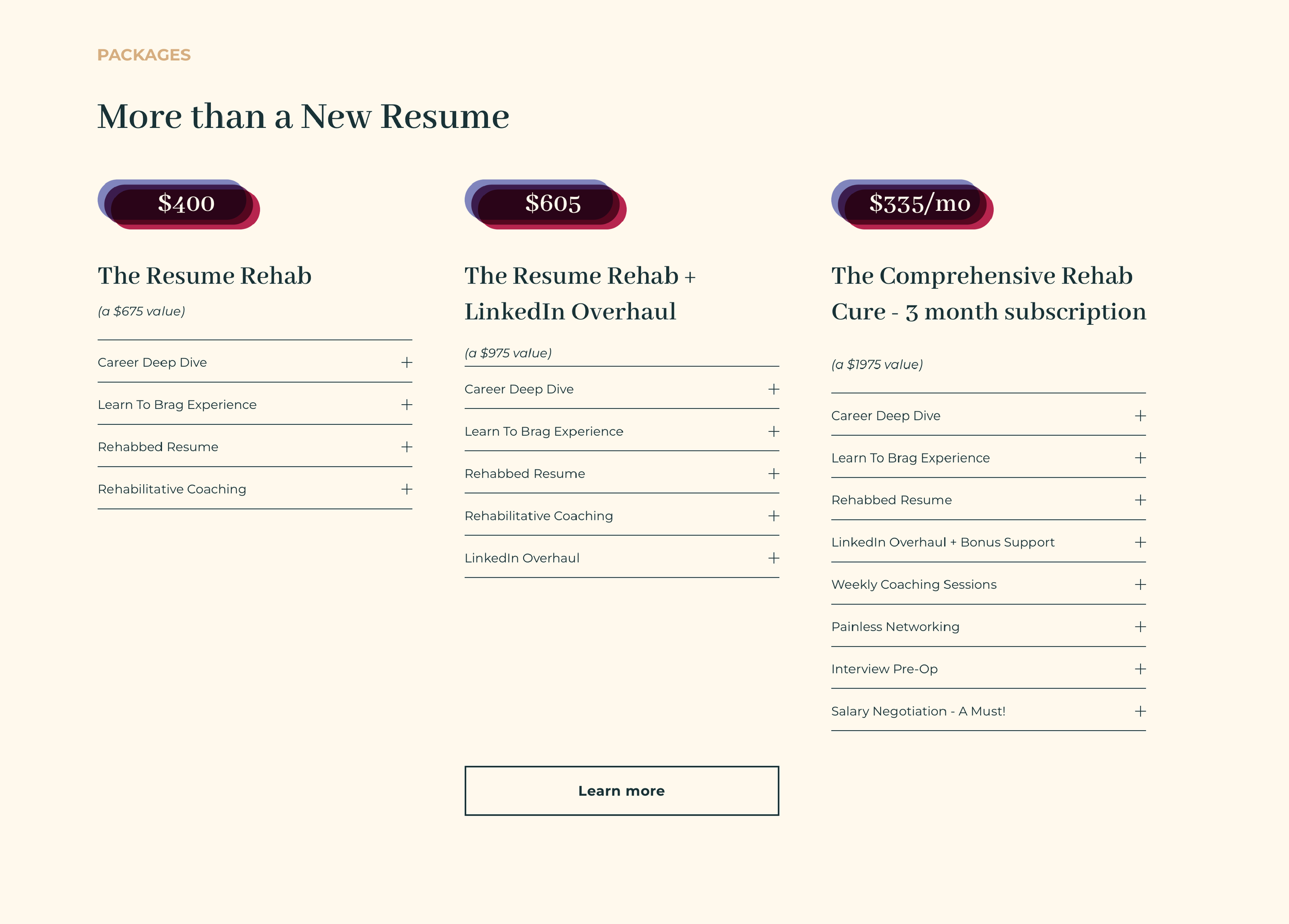
The Result
Resume Rehab now has a clean and clearly defined new style to sell their services. Their content is straightforward and organized, perfect for communicating quickly and succinctly to visitors.


